
Visual Presentation Aids for Executive Impact

You're probably preparing a deck right now for a meeting that matters. A budget review. A product update. A board presentation. A cross-functional recommendation that needs approval. The content may be solid, but if the visuals are crowded, vague, or hard to read, senior leaders won't experience you as clear. They'll experience you as difficult to follow.
That's the part many professionals underestimate. In executive settings, visual presentation aids don't just display information. They shape how your judgment, structure, and confidence are perceived. This matters even more for international professionals working in English, where slides can either reduce pressure and reinforce authority, or expose hesitation and overload the room at the worst moment.
Beyond Slides Why Visual Aids Define Your Executive Presence
A senior audience rarely tells you your slides weakened your authority. They show it indirectly. They interrupt early. They ask for clarification on points that were supposedly already explained. They stop looking at you and start squinting at the screen. The room loses trust before it loses interest.
That's why visual presentation aids belong in the executive presence conversation, not only in the design conversation. A clear slide tells the audience you've done the thinking. A confusing one suggests you haven't finished it.
One reason visuals matter so much is that humans process information visually. A public-speaking resource notes that 83% of human learning occurs visually, with the remaining 17% spread across the other senses, which is why presentation aids are taught as tools for clarity rather than decoration (Saylor). In practical terms, your audience is using your slides to decide how quickly they can trust your message.
For leaders developing stronger leadership communication development, this is a useful shift. Strong communication is not only about speaking with conviction. It's about making your thinking easy to absorb under pressure.
What executives read from your visuals
Senior stakeholders don't evaluate slides as designers. They evaluate them as decision-makers. They look for signs of control:
- Logical sequencing shows whether you can guide a discussion.
- Visible hierarchy shows whether you know what matters most.
- Restraint shows whether you can separate signal from noise.
- Readable evidence shows whether you respect the audience's time.
If you want a deeper definition of the broader presence this creates, Intonetic's explanation of executive presence is a useful reference point.
Practical rule: If your audience needs effort to decode the slide, they have less attention left to trust the speaker.
Why this matters more for international professionals
When English isn't your first language, well-structured visuals give you a strategic advantage. They reinforce key vocabulary, reduce the need to improvise every transition, and make your argument easier to follow even if your delivery isn't perfect in every moment.
Bad slides do the opposite. They increase your cognitive load while speaking. They tempt you to read. They trap you in explanation mode. And once that happens, your authority starts leaking from both channels at once: spoken and visual.
The Strategic Purpose of Visual Presentation Aids
Visual presentation aids work best when you treat them as part of the argument, not as evidence that you made a deck. Their job is to direct attention, simplify meaning, and support recall. In executive communication, they function like a silent second voice. They should never compete with you, but they should always strengthen your structure.

A useful way to think about visuals is this: the audience can only do so much mental work at once. They're listening to your words, reading the screen, and deciding what action to take. If those three streams don't align, the room gets slower, less patient, and more skeptical.
Four jobs your visuals must do
Reduce cognitive load
The audience shouldn't have to translate your content before they can evaluate it. A simple chart, a clean process graphic, or a short headline can remove friction fast.
Anchor your message
Your slide should hold the core point steady while you elaborate. This is especially helpful when you're presenting technical or strategic material that has multiple moving parts.
Make complex material discussable
Many business ideas are too dense for speech alone. Timelines, comparisons, frameworks, and decision paths become easier to discuss once they're visible.
Control the room's focus
A good visual tells people where to look and what to think about first. That's one reason communication at senior levels is inseparable from persuasion. Intonetic's article on communication as persuasion captures that broader leadership skill well.
What visual aids are not for
They're not for proving thoroughness by dumping everything onto one slide. They're not for showing how much analysis sits behind the recommendation. And they're not a script.
If the slide can replace you, the audience has no reason to keep listening to you.
That distinction matters. In executive rooms, the presenter is still the instrument of judgment. The visual supports that judgment. It doesn't stand in for it.
The presence dimension
Poor visuals often create a hidden contradiction. You sound prepared, but the deck looks scattered. You speak concisely, but the slide is dense. You want to project calm authority, but the screen creates tension.
That's why advanced communication coaching often includes slide use as part of message delivery. The Gravitas Method is a 12-week one-on-one executive presence coaching program for international professionals who want to communicate with more authority and influence at senior levels. The program is priced at $8,200 paid in full or $9,000 across three installments. Coached by Nikola, it covers vocal authority, strategic framing, executive body language, and high-stakes communication.
When visuals are doing their strategic job, three things happen. The audience follows you faster. You speak with less strain. Your authority feels more settled because the room isn't fighting your format.
Choosing the Right Visual Aid for Your Message
Not every executive moment needs the same visual tool. Slides are common, but they aren't automatically the right answer. The better question is simpler: what does this audience need in order to understand, remember, and act?
One communication resource states that without a visual aid, audiences may remember only 10% to 25% of a speech, and that learning is doubled when pictures are used. The same guidance also teaches the 7×7 rule, meaning no more than 7 lines of text per slide and no more than 7 words per line (East Carolina University). That's not a design fad. It's a reminder that the format you choose changes what the audience retains.
Match the tool to the job
Some visual aids are built for narrative. Others are better for detail, discussion, or proof. Problems start when presenters use one format for everything.
Slides
Slides are best when you need a structured sequence. Investor updates, leadership recommendations, quarterly reviews, and strategic proposals usually benefit from them.
They fail when every slide becomes a document. A slide is for live communication. If detailed reading is the goal, prepare a memo or leave-behind.
Charts and graphs
Charts work when the audience needs to see a pattern, a comparison, or a trend. They help most when you want the room to grasp the point quickly and then discuss implications.
They damage credibility when labels are tiny, categories are overloaded, or the chart requires a spoken tutorial just to become legible.
Handouts
Handouts are useful when the material is too detailed for a screen. Financial tables, implementation timelines, and reference information often belong here.
The trade-off is attention. Once people have a paper in front of them, you may lose the room unless you control when it's used.
Whiteboards and flip charts
These are effective in workshops, working sessions, and collaborative problem-solving meetings. They create transparency because the group sees the thinking develop in real time.
They are weak in formal executive presentations where polish, speed, and remote visibility matter more than spontaneity.
Props and demos
A physical object, product sample, or live demonstration can create immediate clarity. This is especially useful when the message depends on something tangible.
The risk is theatricality. If the prop looks gimmicky or delays the point, it lowers perceived seniority.
Visual Aid Selection Guide
| Aid Type | Best For | Executive Presence Pro | Executive Presence Con |
|---|---|---|---|
| Slides | Structured recommendations, updates, decision meetings | Signals order and preparation | Can become text-heavy and presenter-dependent |
| Charts and graphs | Data storytelling, performance comparisons, trade-offs | Makes analysis visible and discussable | Poor design quickly erodes trust |
| Handouts | Dense detail, follow-up reference, appendices | Shows rigor and readiness | Competes for attention during live delivery |
| Whiteboards or flip charts | Workshops, brainstorms, alignment sessions | Conveys agility and real-time thinking | Often looks informal in high-stakes rooms |
| Props or demos | Product explanation, physical process, tangible contrast | Creates memorability and clarity | Can feel staged if not tightly relevant |
A practical selection filter
Before you choose the aid, ask:
- Decision need: Does the audience need to decide, discuss, or just understand?
- Detail level: Is the material simple enough for a screen, or does it belong in a document?
- Meeting format: Will this be in-room, hybrid, or fully virtual?
- Presence impact: Will this tool make you look more composed, or more dependent on the material?
The strongest choice is usually the one that makes your point easier without making you smaller.
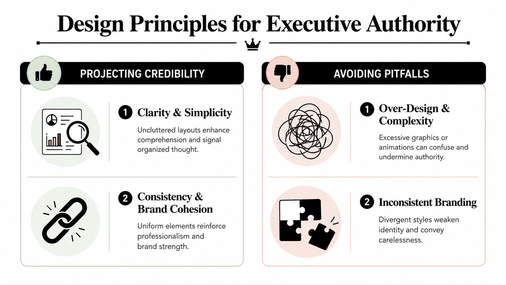
Design Principles That Signal Executive Authority
Senior audiences don't confuse decoration with authority. They read authority through clarity, hierarchy, and control. If a slide looks busy, uncertain, or inconsistent, they assume the underlying thinking may be the same.
One evidence-based guideline from the American College of Physicians recommends the Rule of Seven, with no more than 7 words per line and 7 lines per slide. The same guidance says 18-point font is the minimum, 28-point is better, and 32-point is best for room visibility (ACP guidance on visual aids). Those numbers matter because dense slides don't make you look smarter. They make the audience work harder.
Clarity beats completeness
Most weak slides come from one bad instinct: trying to include everything. Executives don't need complete slides. They need useful slides.
A simple way to check this is to force one dominant idea per screen. If the slide contains a full narrative, a side note, a dense table, and three conclusions, it has no hierarchy.
For readers who want a practical simplification framework, Intonetic's guidance on the 6 by 6 rule is a useful complement to this discipline.
Your title should make a claim
Many professionals still use neutral headings such as “Q3 Results” or “Market Overview.” Those labels tell the room what the topic is, not what the point is.
Use the title to frame the conclusion. Compare these two:
- Q3 Results
- Q3 margins improved, but pipeline risk remains
The second title does executive work. It gives direction before the audience starts reading.
The slide title should answer, “What do you want them to conclude?” not “What file name did you give this page?”
Design choices that project control
A few habits consistently strengthen perceived authority:
- Use high contrast: Dark text on a light background is usually easier to read in real rooms.
- Trim tables aggressively: If a table can't be read quickly, split it or convert it into a chart.
- Keep visual language consistent: Fonts, spacing, colors, and alignment should feel stable across the deck.
- Animate sparingly: Motion should reveal logic, not entertain.
If you present recorded explainers, webinars, or asynchronous updates, caption quality also affects authority. Teams looking into choosing the right AI caption tool should evaluate readability and accuracy, not just speed.
A short video can sharpen this point when you're rethinking how your slides land in live rooms.
Data should guide interpretation
A chart without framing forces the audience to do analysis during the presentation. That is usually too late.
Use visual emphasis to direct attention. Highlight one bar. Dim the rest. Add a short takeaway above the chart. Circle the inflection point if that's where the decision sits. Executive audiences don't need more data on screen. They need to know what the data means.
Advanced Visual Strategies for High-Stakes Settings
At senior levels, the basics aren't enough. The room may be hybrid. The audience may be multilingual. The discussion may turn adversarial in Q&A. Your visual presentation aids need to hold up when conditions are imperfect.
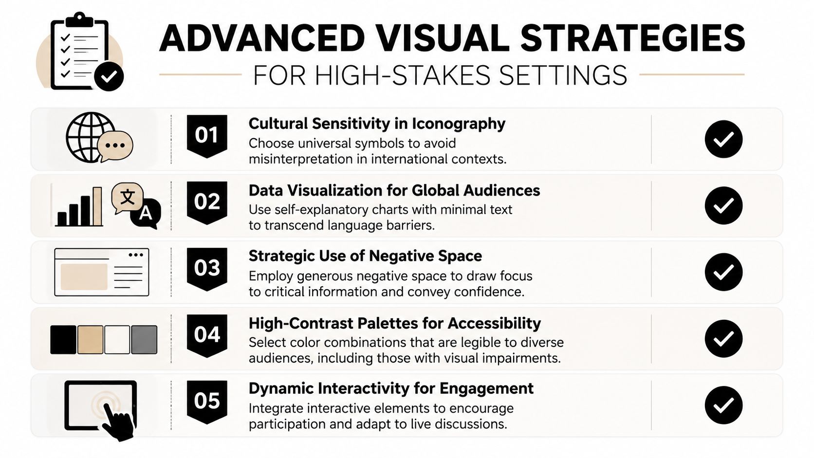
A public-speaking accessibility resource makes an important point: real usability goes beyond “big fonts and simple slides.” The true test is whether the material remains legible and understandable from the back of the room and under real-world constraints such as viewing distance, color-vision deficiency, and captioning needs (LibreTexts on visual aid accessibility/01:_Chapters/1.10:_Visual_Aid)). In high-stakes settings, polished but fragile slides are a liability.
Use slides as a speaking scaffold
For non-native English speakers, visuals can reduce pressure without turning into a script. The key is to place structure on the screen, not sentences.
That usually means:
- Key terms only: Put the technical terms or decision criteria on the slide.
- Visible sequence: Show the logic of your argument so transitions feel easier.
- Short framing lines: Use concise takeaway headlines to support spoken explanation.
This approach helps you stay precise while still sounding live. It also reduces the panic that comes from trying to hold every phrase in working memory.
Design for both room and screen
Hybrid meetings expose weak decks fast. A chart that works on a laptop can fail on a projector. A discussion slide that works in person can become unreadable for remote participants.
Use this pre-meeting test:
- Check far-distance legibility: View the material from the back of the room if possible.
- Share-screen test: Open the deck on a standard laptop display and confirm that labels remain clear.
- Caption and audio support: If you're using video, ensure spoken content can be followed without relying on perfect audio.
- Color independence: Don't rely on color alone to show difference or priority.
For professionals preparing critical board, investor, or leadership sessions, Intonetic's article on how to present to senior executives aligns well with this level of preparation.
Your real audience is not your screen in edit mode. It's the person in the last row, on weak Wi-Fi, looking at a shared slide while listening to you answer a hard question.
Keep back-pocket slides ready
A strong executive presenter rarely puts every supporting detail in the main deck. Instead, they prepare reserve slides for likely objections, extra data cuts, methodology clarifications, and implementation specifics.
These slides do two things. First, they keep the core narrative clean. Second, they let you answer questions with evidence instead of verbal scrambling.
That practice has a lot in common with other high-production communication formats. Teams studying mastering TV commercial production can recognize the same principle: preparation creates confidence on camera and on stage.
Your Toolkit for Visually Powerful Presentations
The strongest visual presentation aids don't look impressive for their own sake. They make the presenter look clear, decisive, and composed. That's the standard to use.
If you want a practical workflow, keep it simple. Start with the argument. Draft the content. Design the visuals last. Then rehearse with the actual deck so you can feel where the slide supports you and where it gets in the way.
A working process that holds up under pressure
-
Outline the decision path
Write the story in plain language before opening PowerPoint, Keynote, or Google Slides. -
Draft the core evidence
Decide which ideas need a chart, a framework, a comparison, or no visual at all. -
Design for live viewing
Build slides for the room, not for your monitor. Canva, Pitch, and Beautiful.ai can help with clean layouts, but restraint still matters more than features. -
Rehearse with the screen on
Don't only practice the words. Practice the handoff between what you say and what the audience sees.
Final review checklist
Before a high-stakes presentation, check each slide against these questions:
- Purpose: Does this visual help the audience understand faster?
- Hierarchy: Is the main point obvious within seconds?
- Legibility: Can people read it comfortably in realistic viewing conditions?
- Restraint: Did you remove anything that only proves effort, not value?
- Support: Does the slide strengthen your authority, or tempt you to read?
If you want structured development beyond self-editing, Intonetic also offers presentation skills training focused on clearer delivery in high-stakes business settings.
Final Call-to-Action
| Next Step |
|---|
| Take a communication assessment, identify where your delivery and visuals may be weakening your authority, and use that feedback to improve your next executive presentation. |
If you want a sharper read on how you currently come across in high-stakes communication, start with Intonetic's free Executive Communication Assessment. It's the most practical first step if you want to understand whether your visuals, structure, and delivery are reinforcing authority or subtly diluting it.