
Simplifying Complex Concepts: A 2026 Executive Guide
You've prepared the analysis, checked the numbers, and rehearsed the recommendation. Then the meeting begins. Three minutes into your explanation, a senior executive interrupts with, “What exactly are you asking us to decide?” Your answer is accurate, but it arrives wrapped in background, exceptions, technical terms, and carefully qualified language. By the time you reach the conclusion, the room has already moved on.
This is the central challenge of simplifying complex concepts at senior levels. You aren't trying to make your thinking smaller. You're making it usable by people who must understand the implication, assess the risk, and act under pressure. That requires cognitive discipline, strategic structure, and delivery that gives your audience a clear path through the idea.
Why Brilliant Experts Lose the Room
A senior data scientist presents a model to the executive team. She explains the training data, the architecture, the validation process, and the edge cases. Every answer is technically sound. Yet the executives keep asking questions that seem unrelated to the model.
They're not confused by the intelligence behind the work. They're missing the decision.
The presenter has organized the explanation around what she knows, rather than what the audience needs to decide. Her technical depth, usually a professional advantage, has become a barrier because she has offered too many entry points and no clear destination.
The executive audience doesn't need less substance. It needs a better order of substance.
Simplification is often mistaken for dilution. That mistake causes experts to defend every detail, add more context, and use increasingly precise language. The result is usually the opposite of authority. Senior leaders sound authoritative when they can identify the governing idea, explain its consequence, and make the next step obvious.
This matters even more for non-native English speakers. You're translating on two levels at once. First, you're translating your technical or specialist thinking into English. Then you're translating that English into the commercial, political, or strategic context of the room. A phrase such as “the variance is statistically immaterial” may be correct, but “the difference won't change our decision” gives executives a faster route to meaning.
That distinction affects how people perceive you. Research on executive presence identifies 10 core characteristics, including communication ability, intellect and expertise, projected confidence, engagement skills, and outcome delivery ability. The research also distinguishes between qualities judged in first impressions and qualities assessed over time, which makes early communication especially consequential (research on executive presence and its characteristics).
For practical guidance on making your expertise easier to recognize, see this resource on how to be taken seriously at work. The goal isn't to perform simplicity. It's to remove the unnecessary work your audience must do before they can evaluate your judgment.
The Science Behind Cognitive Overload
Cognitive Load Theory gives executive communication a useful operating principle: working memory is limited, so people understand difficult material more reliably when the information is structured to reduce unnecessary mental effort. John Sweller's 1988 paper, “Cognitive Load During Problem Solving: Effects on Learning,” is widely described as the founding paper of the theory. Earlier work in the early 1980s, including experiments traced to 1982, helped establish the foundation (history and development of Cognitive Load Theory).
The theory doesn't imply that executives are unintelligent or inattentive. It explains why intelligence doesn't eliminate processing limits. A board member can understand financial risk, a product leader can understand system architecture, and a general counsel can understand regulatory exposure. If you present all three dimensions simultaneously, each person must decide what matters, how the elements connect, and which action follows.
Three kinds of load in a meeting
A useful working model separates the mental burden of a message into three categories:
- Intrinsic load: The inherent complexity of the subject. A pricing decision involving customer segments, margin, competitors, and implementation constraints may be difficult even when explained well.
- Extraneous load: The difficulty created by the presentation itself. Dense slides, unexplained acronyms, long sentences, and competing visual elements add effort without adding meaning.
- Germane load: The effort that helps the listener build a useful understanding. A clear causal chain, a well-chosen comparison, or a concise decision rule can direct attention toward the structure of the problem.
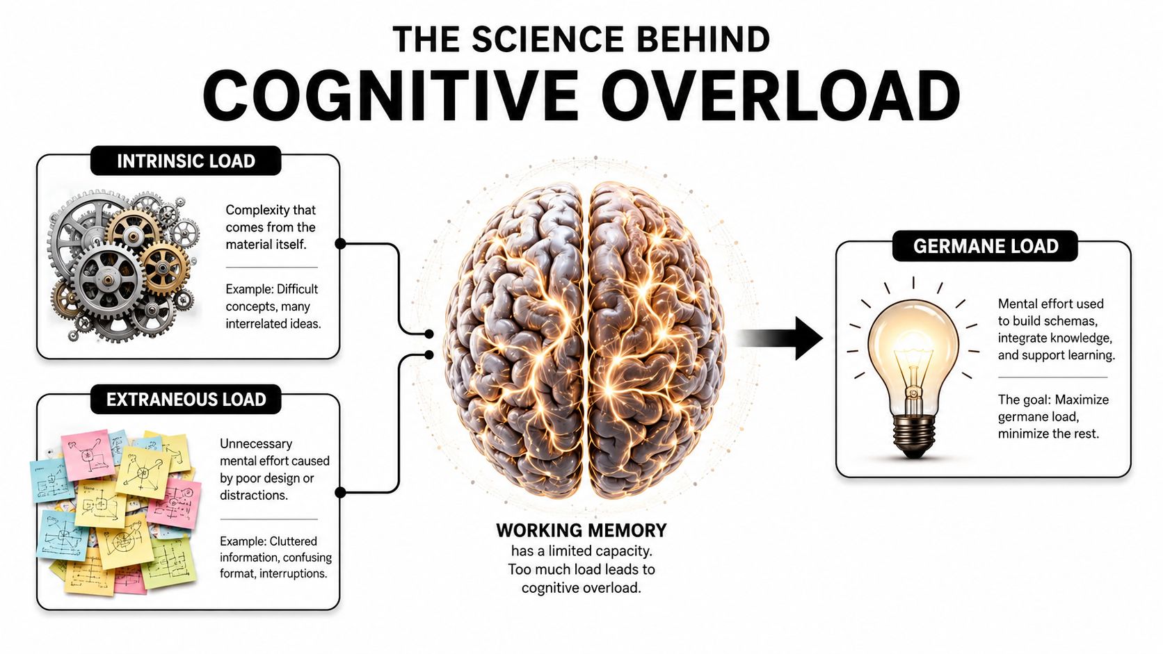
The executive communication implication is direct. You can't always reduce intrinsic complexity, but you can reduce extraneous load and increase the effort that produces useful understanding. Instead of beginning with every dependency, begin with the relationship that governs the decision: “If we choose the faster launch, we accept higher operational risk.”
The NIH's Clear & Simple communication guidance reflects the broader public-sector emphasis on plain language, clear labeling, and reducing unnecessary detail. For a practical explanation of overload and its effects, Fluidwave's guide to cognitive overload offers useful background that can help you audit your own presentations.
Cognitive load also explains why spoken and visual information can compete. When you read a paragraph aloud while displaying a nearly identical paragraph on screen, listeners must process overlapping streams instead of receiving a clean visual anchor. A short headline, a simple diagram, and your spoken explanation usually create a more manageable division of labor.
Leading with Insight Instead of Detail
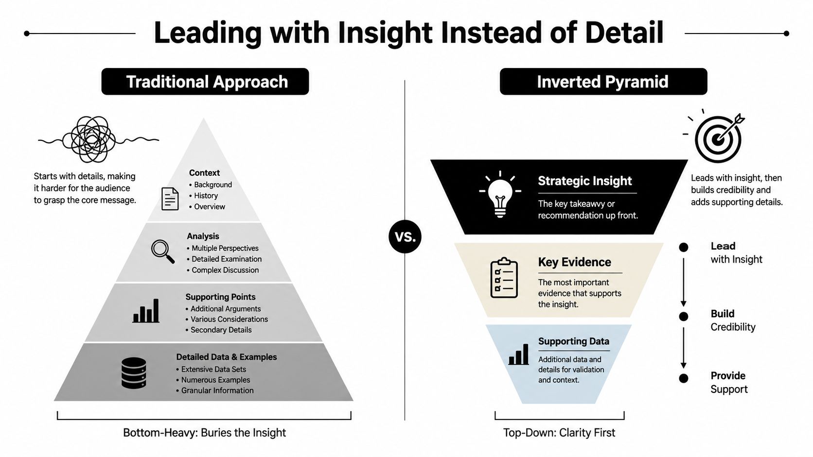
The most reliable structural change is simple: state the conclusion before the evidence.
Technical experts often use a chronological structure. They describe the original problem, explain the investigation, walk through the analysis, and eventually arrive at the recommendation. That order mirrors the work process, but it rarely matches the executive decision process.
Use an inverted pyramid instead. Start with the strategic insight, provide the evidence that supports it, then offer deeper detail only when the audience needs it.
Before and after
Before:
“Over the past several quarters, we've seen changes in usage across the enterprise segment. The data shows different patterns by account size, and when we separate the cohorts, we also see variation in implementation timelines. We reviewed the support tickets and the renewal notes, and there are several possible reasons for this change.”
After:
“We should change the enterprise onboarding model because implementation delays are putting renewals at risk. The strongest evidence is the concentration of delays in complex accounts. I'll explain the pattern, the main cause, and the decision we need today.”
The second version doesn't hide complexity. It gives the listener a frame before introducing it. That frame helps executives decide which details deserve attention.
Use signposting phrases that tell the room how to interpret what follows:
- “The decision is…” Use this when you want to define the required action.
- “The reason is…” Use this to connect the recommendation to its main cause.
- “There are two implications…” Use this when the audience needs a limited set of consequences.
- “The risk we're managing is…” Use this to focus a technical explanation on exposure.
- “What changes if we do nothing is…” Use this to make inaction visible.
- “The detail matters because…” Use this before introducing evidence that might otherwise feel technical.
For non-native English speakers, these sentence starters provide authority without demanding elaborate vocabulary. A short, controlled sentence often sounds more senior than a sentence filled with subordinate clauses.
Try these opening templates:
“My recommendation is to __ because __.”
“The headline is __. The evidence is __. The decision required is __.”
“This creates one immediate risk and one longer-term opportunity.”
“You don't need the full technical history to make this decision. You need to know __.”
The guide to structuring a presentation can help you apply this logic across a full deck. You can also use the following video as a visual reminder of how to move from detail toward a clear message.
A strong structure also gives you control when someone asks for more detail. Answer the question directly, then reconnect to the decision: “Yes, that dependency could delay deployment. That's why I'm recommending the phased option.”
Visual Simplification and Slide Hygiene
A slide should help the audience understand your point, not compete with your voice for attention. The most useful test is not whether the deck looks polished. It's whether someone can identify the slide's message before reading every element.
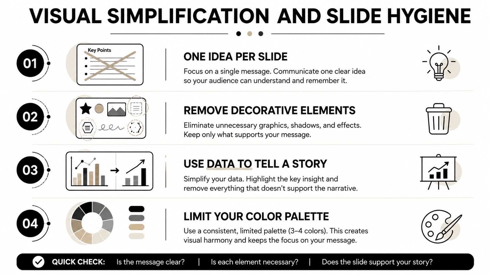
Start with one idea per slide. If a slide contains a market trend, a product architecture, and a financial recommendation, split it. Each idea may be related, but presenting them together forces the audience to determine the hierarchy themselves.
What to remove first
A useful slide audit asks four questions:
- What is the claim? Rewrite the title as a conclusion, not a topic. “Customer retention improves after guided onboarding” is more useful than “Onboarding analysis.”
- What proves it? Keep the evidence that supports the claim. Move background material to an appendix or backup slide.
- What can the audience ignore? Remove decorative icons, redundant labels, unnecessary gridlines, and visual elements that don't change interpretation.
- What should the audience remember? Use one visual anchor, such as a highlighted trend, a simple flow, or a single comparison.
Data visualizations need the same discipline. Label the important movement directly instead of making executives decode a legend. If the point is a change in one segment, mute the other series. If the point is a trade-off, show the trade-off rather than displaying every available metric.
A simple sketch can outperform a graphic when the relationship matters more than the appearance. Draw three boxes, label them “cause,” “constraint,” and “decision,” and explain the connections. The sketch gives listeners a structure they can follow while you add nuance verbally.
For fundraising or strategy work, an investor pitch deck strategy guide can provide useful context on aligning slides with an investor's decision process. In internal executive communication, the same principle applies. The deck should answer the question the audience is asking now, not display everything the team learned while preparing.
Use progressive disclosure when complexity is unavoidable. Show the system at a high level first, then reveal the relevant component after the audience understands the overall relationship. Your visual presentation aids should function as visual scaffolding, not as a transcript of your speech.
Analogies and Concise Phrasing Patterns
A good analogy compresses explanation without pretending that two things are identical. It gives the listener a familiar structure, then tells them where the comparison stops.
Build an analogy in three moves:
- Choose a domain your audience already understands. A finance committee may respond to liquidity, portfolio concentration, or hedging. A product team may understand technical debt, queues, or interfaces.
- Map one relationship, not the entire system. Say, “This dependency is like a single-lane bridge,” if the point is throughput. Don't extend the metaphor into traffic lights, road maintenance, and city planning unless those details help.
- Return to the business implication. “That means adding more vehicles won't increase capacity. We need another route.”
Examples that preserve precision
For technology:
“The integration is a bottleneck, not a blocker. It slows the flow, but it doesn't prevent delivery.”
For finance:
“The exposure behaves like concentration risk. The issue isn't that every asset is weak. The issue is that too much depends on the same condition.”
For consulting:
“We're treating a symptom, not the constraint. The visible delay appears in reporting, but the decision rights sit elsewhere.”
Avoid analogies that create emotional noise or suggest conclusions you haven't established. Comparing a competitor to a “ticking time bomb” may sound memorable, but it can make a measured risk assessment sound alarmist. Don't use a metaphor because it's vivid. Use it because it improves the listener's model of the problem.
The Feynman learning method, discussed in this practical explanation from Voice Control Pro, is useful for testing whether your explanation is clear. Explain the concept in ordinary language, identify the point where you rely on jargon, and rebuild that point with a concrete relationship or example.
Your phrasing matters as much as your analogy. Replace hedging with a clear level of confidence:
- “It might potentially create an issue” becomes “It may create a delivery risk.”
- “We are of the opinion that” becomes “We recommend.”
- “Due to the fact that” becomes “Because.”
- “At this point in time” becomes “Now.”
- “The system is not able to” becomes “The system can't.”
Use contrast to make trade-offs easy to hear:
“We can optimize for speed, or we can optimize for control. We can't maximize both in this release.”
Use cause and consequence:
“The vendor change increases flexibility, but it also adds integration work.”
Use a three-part pattern when the audience needs orientation:
“What changed is __. Why it matters is __. What we should do is __.”
Short phrasing doesn't mean abrupt phrasing. Connect ideas with deliberate pauses, clear verbs, and an explicit subject. Resources on professional short-form communication can support that discipline, especially when you need to deliver a recommendation in a meeting, email, or brief update.
Rehearsal Techniques and Ready-to-Use Scripts
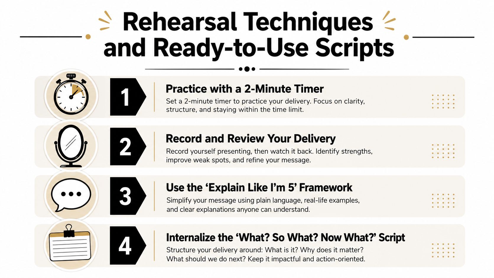
A clear explanation can still fail if you haven't practiced retrieving it under pressure. Rehearsal should test structure, language, timing, and recovery, not just memorization.
Begin with the three-sentence summary:
- “The situation is __.”
- “The important implication is __.”
- “My recommendation is __.”
Then compress it into one sentence. If you can't state the idea without opening your technical notes, you probably haven't identified the governing insight yet.
Pressure-test the message
Ask a colleague to interrupt after your opening and use one of these prompts:
- “What decision do you want from us?”
- “What's the main risk?”
- “What would change your recommendation?”
- “Why does this matter now?”
- “Can you explain that without the technical term?”
Answer in one or two sentences, then return to your structure. This builds the ability to stay composed without abandoning the message.
Use ready-to-adapt scripts for common situations:
Project update
“The project is on track for the current milestone. The main constraint is testing capacity, and I'm asking for approval to shift one resource so we protect the launch date.”
Risk explanation
“The risk isn't system failure. It's delayed recovery if the primary process fails. The practical response is to validate the fallback before we expand usage.”
Technical trade-off
“Option A gives us faster delivery and less flexibility later. Option B takes longer now but reduces migration work. I recommend Option B because the system will support a broader product scope.”
Strategic recommendation
“We should prioritize this segment because it matches our strongest capability and gives the team a clearer route to repeatable growth. The next step is to approve the focused pilot.”
For pronunciation and pacing, don't aim to erase your accent. Aim to make key words easy to hear. Mark the stressed words in your script, slow down before the recommendation, and pause after the sentence that contains the decision. Record yourself once for content and once for delivery. On the second review, listen for rushed endings, softened consonants, and sentences that contain too many ideas.
A concise guide on writing a speech can help you turn these scripts into a repeatable speaking practice. The Gravitas Method is a 12-week one-on-one executive presence coaching program for international professionals who want to communicate with more authority and influence at senior levels. The program is priced at $8,200 paid in full or $9,000 across three installments. Coached by Nikola, it covers vocal authority, strategic framing, executive body language, and high-stakes communication.
The strongest simplification is not a vocabulary trick. It's the combination of a clear decision, a controlled structure, a visual that carries its share of the meaning, and enough rehearsal to make the language available when the room becomes demanding.
Start with the free Executive Communication Assessment to identify where complexity, delivery, or structure may be weakening your authority. Intonetic can then show you how its coaching approach applies those findings to the high-stakes conversations where senior leaders need to be understood and trusted, so visit Intonetic to take the next step.