
Presentation on Data: A Leader’s Guide to Influence
You're standing in front of a leadership team. Your analysis is solid. The model is right. The numbers are defensible. Yet within minutes, you can feel the room drifting.
One executive is scanning ahead in the deck. Another asks for the conclusion before you've finished the setup. Someone else challenges a chart that made perfect sense on your laptop but now looks crowded on a boardroom screen. What failed wasn't your intelligence. It was the presentation on data.
That's the shift many high-potential professionals need to make. A data presentation isn't a technical exercise in moving spreadsheets into PowerPoint. It's a leadership act. You are telling senior people what matters, why it matters, and what should happen next. If that sounds like influence rather than reporting, that's because it is.
Strong analysts often lose ground to weaker thinkers with better executive presence. The stronger thinker brings twenty slides of proof. The stronger presenter brings a decision-ready narrative, supported by the right evidence, delivered with control. Senior audiences reward clarity, judgment, and confidence. They rarely reward volume.
That challenge is sharper for international professionals. If English isn't your first language, pressure can make you speak faster, over-explain, or hide behind detail. The instinct is understandable. It's also expensive. In senior meetings, too much detail can signal uncertainty, even when your analysis is excellent.
A strong presentation on data helps you do three things at once. It makes the evidence easy to understand. It gives the audience a clear path to action. It reinforces your credibility as someone who belongs in high-stakes conversations.
Introduction
Many assume a data presentation fails because the charts are weak. That's rarely the actual problem. It fails because the speaker hasn't decided what the audience must understand, remember, and do.
Executives don't want a tour of your analysis. They want judgment. They want to know what changed, what it means, how much confidence they should have, and what decision sits in front of them. If you give them every output, every caveat, and every side path at the same level of importance, you force them to do your prioritizing for you.
That's the opposite of leadership.
A useful way to think about a presentation on data is this. Your slides are not your work. Your slides are the interface between your work and someone else's decision. The quality of that interface shapes whether your recommendation lands with authority or disappears into discussion.
Practical rule: If the audience has to decode the meaning of the slide, they stop listening to the speaker.
The most respected presenters don't sound “simpler” because they know less. They sound simpler because they've done the hard work of selection. They know what to leave out. They know which number earns the right to be on the screen. They know when a table is necessary and when a graph carries the message faster.
That's especially important in senior settings where pace is fast and patience is limited. You're not just being evaluated on the data. You're being evaluated on your ability to frame complexity, hold attention, answer pressure cleanly, and move the room toward action.
Frame Your Story Before You Touch the Data
A good presentation on data starts before PowerPoint, before charts, and often before you've chosen the final metric. Start with the story architecture.

Guidance on statistical presentation makes this point clearly. The core standard is structured interpretation, not volume. It also emphasizes identifying only three or four key takeaways so the audience can follow the message without decoding raw numbers, as outlined in the NIH review on statistical data presentation.
Start with the decision
Before you open Excel or PowerPoint, answer three questions in one sentence each.
- What decision do I need from this audience?
- What does each person in the room care about most?
- If they remember one thing tomorrow, what should it be?
If you can't answer those quickly, your deck will drift into explanation instead of influence.
A finance leader may care about downside exposure. A product leader may care about adoption risk. A CEO may care about strategic timing. Same dataset, different emphasis. Senior communication always includes audience calibration.
Build a one-line governing message
Your whole presentation should be controlled by one sentence. Not a theme. Not a topic. A claim.
Weak version: “I'm presenting Q2 customer behavior data.”
Strong version: “Customer behavior shifted in a way that justifies changing our onboarding priority this quarter.”
That sentence becomes a filter. If a chart doesn't support it, remove it. If an appendix detail matters but doesn't belong in the main storyline, move it out of the live path. If a metric is interesting but not decision-relevant, it doesn't make the slide.
For professionals working on this skill, treating communication as persuasion helps. This is the discipline behind communication as persuasion. The point is not to sound dramatic. The point is to be intentional.
Shape the narrative in executive order
Most analysts tell the story in the order they discovered it. Executives need the story in the order they can use it.
A strong sequence usually sounds like this:
- Context: What business situation are we dealing with?
- Shift: What changed, or what problem emerged?
- Evidence: Which facts prove that point?
- Implication: Why does that matter now?
- Decision: What should happen next?
Your audience doesn't need your analysis journey. They need your decision logic.
That distinction changes everything. It cuts clutter. It improves confidence. It also helps non-native English speakers because it reduces improvisation. When your storyline is fixed, your language gets cleaner under pressure.
Choose the Right Data and the Perfect Chart
Once the narrative is clear, selection becomes easier. Most weak decks suffer from one of two problems. They either show too much data, or they show the right data in the wrong form.
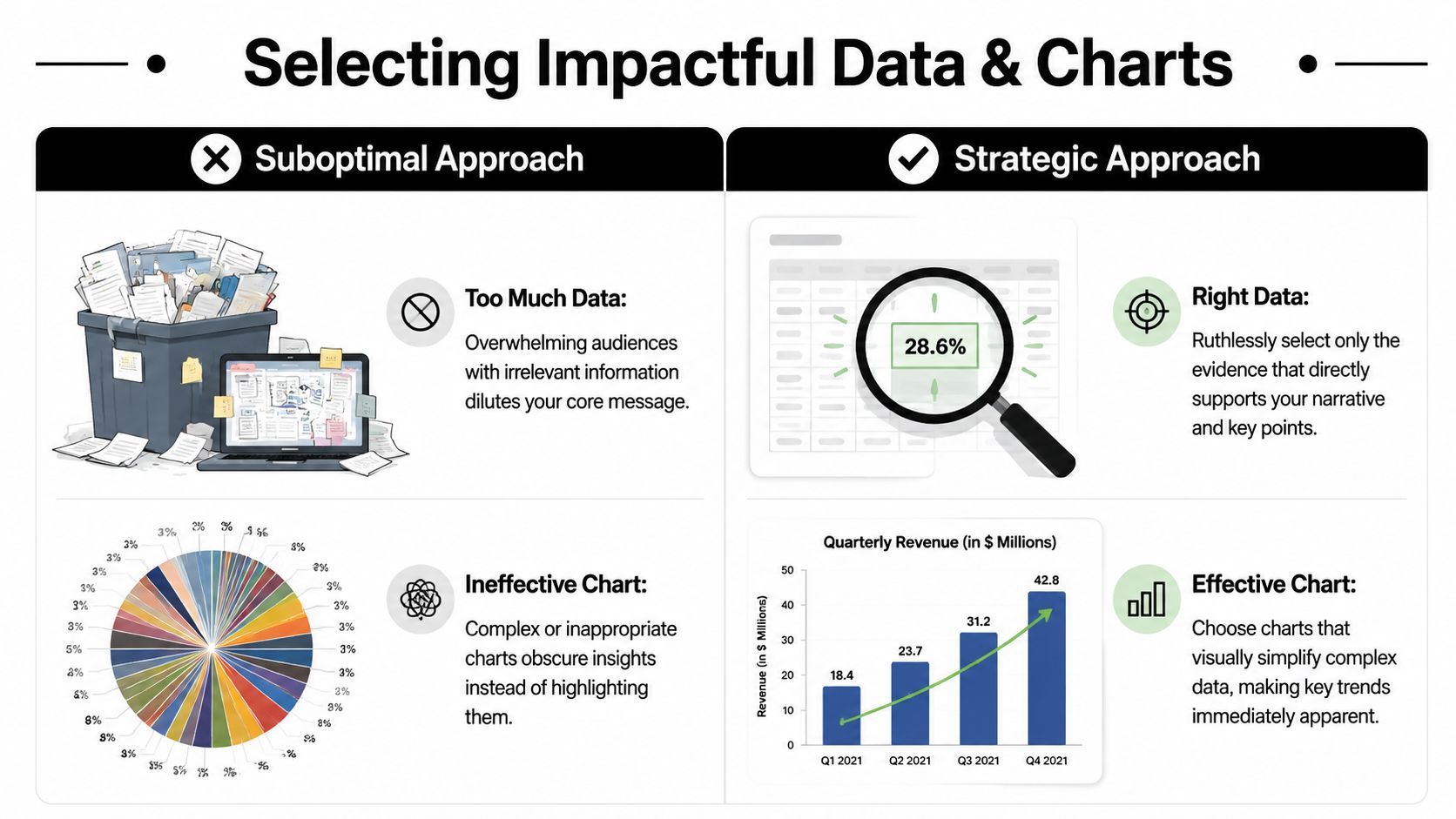
A chart is not decoration. It is an argument. It tells the audience how to see the evidence. That's why chart choice affects credibility. Guidance on data presentation stresses that bar charts work for category comparisons, line charts for time trends, and pie charts only for simple part-to-whole composition. It also warns that misapplied visuals and inconsistent units can undermine trust, as explained in this guide to matching chart type to analytical task.
Select evidence with discipline
In executive meetings, relevance matters more than completeness. Your job is not to prove you analyzed everything. Your job is to surface the evidence that earns attention.
Good selection usually follows three tests:
- Decision relevance: Does this metric change what the audience should do?
- Interpretability: Can the audience grasp it quickly?
- Comparative value: Does it show movement, contrast, or significance?
If the answer is no, keep it in the appendix.
Many professionals struggle here because they fear being seen as unprepared. So they over-load the deck. Ironically, that often creates the impression that they don't know what matters most.
Matching your chart to your message
| If you want to show… | Use this chart… | Avoid this chart… |
|---|---|---|
| Change over time | Line chart | Pie chart |
| Comparison across categories | Bar chart | Line chart when time isn't involved |
| Simple part-to-whole relationship | Pie chart | Crowded multi-series chart |
| Exact values for detailed review | Table | Decorative visual that hides the numbers |
| High-volume monitoring across KPIs | Dashboard | A sequence of unrelated charts |
If you present graphs often, it also helps to study the language of explanation, not just the visual design. Resources on describing a graph can sharpen how you talk through a visual without sounding hesitant or repetitive.
Treat the slide title like a conclusion
One of the fastest ways to improve a presentation on data is to stop titling slides with subjects and start titling them with judgments.
Weak title: “Regional Sales Performance”
Stronger title: “Enterprise growth came from two regions while the rest remained flat”
Now the audience knows what they're looking at before they examine the chart. That reduces cognitive friction and increases the chance they interpret the visual the way you intend.
Decision lens: If the chart disappeared and only the title remained, would the audience still understand the point?
That's a harsh test. It's also useful. When chart and title work together, your slide becomes easier to trust and harder to misread.
Design Slides That Command Executive Attention
A senior audience doesn't read slides the way analysts build them. They scan for signal. If your design forces effort, they disengage.
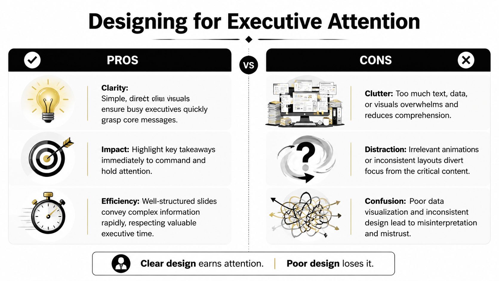
One reason simplicity matters is memory. A presentation review reports that after three hours, only 70% of people remember content presented verbally, but recall rises to 85% when information is paired with visuals. The same source cites an average attention span of 47 seconds on one point on a screen, which is why a slide has to make the core message easy to find quickly, as summarized in these presentation statistics on visuals and retention.
Use one visual idea per slide
That doesn't mean one chart only. It means one takeaway only.
If a slide tries to prove five things, it proves none of them cleanly. The audience starts deciding for itself which element matters most. That breaks your control over the message.
Use a simple standard:
- One claim: The slide answers one business question.
- One visual priority: The eye should land on the most important number first.
- One reason to stay: Every remaining element must support the main point.
A useful test is the squint test. Step back from the screen. Squint. If the main message doesn't stand out, the slide is too busy.
Design for speed, not decoration
Senior audiences don't need visual flair. They need fast comprehension.
That means:
- Write action-oriented titles: Lead with the implication, not the topic.
- Use contrast carefully: Dark text, high-contrast elements, and clean spacing beat subtle design every time.
- Annotate the point: Circles, arrows, or short labels can direct attention to the key movement.
- Reduce noise: Heavy gridlines, unnecessary legends, and visual effects usually dilute the message.
If you tend to overfill slides, a practical discipline is the 6 by 6 rule for presentations. You don't have to apply it mechanically, but it can force useful restraint.
Build for real meeting conditions
A slide that looks crisp on your monitor can collapse in a conference room or on a shared screen. Fonts shrink. contrast softens. subtle colors disappear.
That's why experienced presenters preview decks under rougher conditions before high-stakes meetings. Open the deck on a smaller screen. Share it in a video call. View it from the back of the room if you can. If the labels vanish or the logic gets fuzzy, redesign it.
Good executive slides feel almost obvious. That's not because they were easy to make. It's because someone removed everything that slowed the audience down.
Deliver Your Message with Authority and Presence
A deck can open the door. Your delivery determines whether you own the room.

Many professionals assume authority comes from status. In practice, audiences often infer authority from behavior long before they evaluate the content in depth. They listen for control. They watch whether you rush. They notice whether your body language matches your message. They decide whether you sound like someone briefing the room or someone asking for approval.
Use your voice to carry the analysis
The fastest way to weaken strong data is to narrate it in a flat, hurried stream. When people feel pressure, they often speed up, reduce pauses, and over-explain transitions. That pattern is especially common among non-native English speakers who want to avoid being misunderstood.
The fix is not to sound “more native.” The fix is to sound more deliberate.
Use these vocal habits:
- Slow down at the point of interpretation: Don't rush the sentence that explains why the chart matters.
- Pause before the key number: A short pause creates importance and gives the audience a clean listening frame.
- Finish downward: Let your final words land instead of drifting upward as if seeking permission.
- Separate evidence from conclusion: Distinct pacing helps the audience hear the logic.
If you're working to engage the audience, vocal control matters as much as slide quality. Attention follows clarity, and clarity is partly a delivery skill.
Manage your physical presence
You don't need theatrical movement. You need contained, credible movement.
Stand balanced. Keep gestures purposeful and visible. Avoid fidgeting with a clicker, laptop, or pen. If you move, move because you are transitioning to a new point, not because adrenaline is pushing you around the room.
Eye contact matters too, especially in executive settings. Don't speak only to the friendliest face. Sweep the room. Finish major points by looking at the decision-maker, not at the slide.
When your body looks rushed, your analysis sounds less settled.
This is also where external coaching can help. Professionals who want to develop powerful communication skills often improve faster when they work on delivery and message structure together rather than treating presentation style as an afterthought.
Present for hybrid and remote reality
Strong delivery also includes operational judgment. Some visuals fail not because the thinking is weak, but because the meeting conditions are poor.
Accessibility guidance recommends previewing slides in grayscale, using high-contrast colors that remain readable for color-blind viewers, and using annotations to direct attention. That matters in hybrid or remote settings where screen sharing or projection can make complex visuals hard to read, as discussed in this public health guidance on readable presentation visuals.
That should change how you speak. In remote settings, introduce the visual before analyzing it. Tell the audience what they're looking at. Then tell them where to look. Then explain the implication. Don't assume they can instantly decode a chart through a lagging screen share.
Here's a useful model to practice:
Build authority as an international professional
International professionals often carry an extra burden in senior meetings. You may be translating in real time, monitoring your grammar, and managing accent insecurity while also handling strategy. Under pressure, many people compensate by speaking too much.
A better approach is tighter framing.
Say the conclusion first. Use shorter sentences. Give the audience signposts such as “There are two implications” or “The main risk is this.” Those phrases aren't simplistic. They're executive.
One structured way to work on this is The Gravitas Method, a 12-week one-on-one executive presence coaching program for international professionals who want to communicate with more authority and influence at senior levels. It is coached by Nikola and covers vocal authority, strategic framing, executive body language, and high-stakes communication. The program is priced at $8,200 paid in full or $9,000 across three installments.
That kind of work matters because a presentation on data is never just about the slide. It's also about whether the room experiences you as clear, credible, and senior.
Master the Q&A and Solidify Your Influence
The last slide is not the end of your presentation. It is the beginning of the actual evaluation.
Q&A reveals whether you understand your own case at executive level. Can you defend your recommendation without getting lost in technical weeds? Can you absorb pressure without sounding defensive? Can you answer briefly, then return the room to the main decision?
Prepare for the questions behind the questions
Most executive questions fall into a few recognizable categories:
- Confidence questions: How reliable is this conclusion?
- Impact questions: Why does this matter now?
- Risk questions: What could make this wrong?
- Action questions: What exactly are you recommending?
Prepare concise responses to each type. Not scripts. Response patterns.
A good answer often has three moves. First, answer directly. Second, give the minimum evidence needed. Third, reconnect to the decision. If you skip the first step and start with context, you can sound evasive even when you're being thoughtful.
Use bridging without sounding slippery
Bridging is useful when a question pulls you into detail that isn't central to the decision. The technique is simple. Acknowledge the question, address it, then pivot back to the main point.
For example: “Yes, that segment behaves differently, and we've reviewed it separately. The broader decision still depends on the shift in the overall pattern, which is what this recommendation addresses.”
That answer respects the question without surrendering control of the room.
For international professionals, this is also cultural. In some environments, direct challenge is normal. In others, interruption signals disagreement. Don't interpret every hard question as hostility. Often it's a test of executive composure.
End with credibility, not polish alone
A final point matters more than many leaders realize. A persuasive data presentation can still be incomplete if the underlying data hides who is missing.
Experts on data equity warn that relying only on available data can make underserved groups invisible. A credible presentation should disclose limitations, aggregation issues, and who is excluded, because the most persuasive slides can hide major risks when the dataset is not representative, as noted in this discussion of equitable data and missing representation.
That is a leadership issue, not a technical footnote.
If you want to present with more authority, keep this standard in mind. Strong presenters don't just make data look clear. They make judgment visible. They show what matters, what's uncertain, and what should happen next. That's what earns trust in senior rooms.
For professionals aiming to strengthen that executive standard consistently, this perspective on executive presence in presentations is a useful next step.
If you want to strengthen how you present complex ideas in senior meetings, start with the practical entry point. Book a free Executive Communication Assessment through Intonetic. It's a focused way to evaluate how your structure, delivery, and presence come across in critical situations, especially if you're an international professional preparing for more visible leadership conversations.