
Command Attention: Formatting Business Reports for Impact
Formatting your business report is more than just making it look nice. It’s about signaling credibility and ensuring your hard work gets the attention it deserves, especially when your audience is a group of busy senior leaders. Proper structure and clear visuals make your key insights immediately accessible—and that makes all the difference.
The Hidden Language of Executive-Ready Reports
We’ve all been there: staring at a blank document, knowing it’s destined for a high-stakes audience. What separates a report that gets acted on from one that’s simply skimmed and forgotten isn't just the data—it's the delivery. Senior leaders instinctively use visual structure as a quick filter for credibility.
Think about it. A messy, disorganized report sends an immediate, negative signal. It suggests a lack of attention to detail or, even worse, a disorganized thought process. On the other hand, a clean, well-organized document conveys competence and, just as importantly, respect for the reader's time.
This is the hidden language of executive-ready reports. It’s a set of unspoken rules that signal your authority before a single word of your analysis is even processed. Mastering these subtle cues is an incredibly powerful tool, especially for international professionals who need to make sure their insights cut through any potential communication barriers.
Why Strategic Formatting Matters More Than You Think
While knowing the fundamentals of how to write a formal report is a great starting point, the real impact comes from understanding the psychology behind executive communication.
The consequences of getting it wrong are surprisingly severe. A landmark 2026 survey by the International Business Communication Association (IBCA) found that 85% of senior leaders in Fortune 500 companies admitted to discarding reports that lacked a clear table of contents and executive summary, citing "overwhelming clutter" as their top frustration.
Eye-tracking studies support this, revealing that poorly structured documents lose 40% more reader engagement within the first 30 seconds. Your brilliant analysis could be dismissed before it even gets a fair chance.
"The format is the first handshake. A cluttered, inconsistent report tells an executive you don't value their time, undermining your message before they've even read the first sentence."
To help you get this right every time, here’s a quick-reference guide to the formatting elements that command attention and signal professionalism to senior leadership.
Key Formatting Elements That Command Executive Attention
| Formatting Element | Why It Matters to Executives | Practical Application |
|---|---|---|
| Clear Headings | Allows for quick scanning to find relevant sections without reading the entire document. | Use a logical hierarchy (H1, H2, H3) with descriptive, action-oriented titles. |
| White Space | Reduces cognitive load and makes the document feel approachable and easy to read. | Use short paragraphs (2-3 sentences), ample margins, and line breaks between sections. |
| Consistent Typography | Signals professionalism and attention to detail. Inconsistency is distracting. | Stick to one or two professional fonts (e.g., Arial, Calibri, Georgia). Use size and weight (bold) for emphasis, not a dozen different fonts. |
| Visual Callouts | Draws the eye to critical data points, quotes, or key takeaways. | Use blockquotes or shaded boxes for important quotes or summary statements. |
By mastering these simple components, you guide your reader’s experience, making it easy for them to find and absorb the information you want them to see.
Applying the Pyramid Principle for Executive Impact
One of the single most effective frameworks for structuring an executive report is the Pyramid Principle. This communication method, first made famous at McKinsey & Company, is simple: start with your main conclusion first, then provide the supporting arguments and data.
This "answer first" approach is non-negotiable for time-crunched leaders. It gives them the core message instantly, allowing them to decide how deep they need to go into the supporting details.
Here’s why it works so well:
- Immediate Clarity: It respects the executive’s schedule by putting the most important information right at the top.
- Enhanced Credibility: It projects confidence and shows that you have a clear, well-reasoned point of view. No beating around the bush.
- Greater Influence: It frames the entire report around the conclusion you want the reader to accept, making your argument more persuasive from the start.
Mastering the subtleties of structure and presentation isn't just about creating a document; it's about crafting an instrument of influence. This is particularly vital for non-native English speakers. A universally clear format speaks a language of professionalism that transcends any perceived linguistic gaps, ensuring your expertise is what truly stands out. You can learn more about how your accent might affect your career and what to do about it in our related article.
Structuring Your Report for Clarity and Influence
A powerful report isn't just a collection of facts; it’s a guided journey. I’ve seen countless brilliant analyses fall flat because they were presented as a data dump rather than a compelling case. A logical structure is what elevates you from analyst to strategic partner.
When you're writing for senior leaders, you have to respect their intelligence and, more importantly, their time. Understanding the principles of strong structure in writing is the foundation for getting your point across effectively and influencing decisions.
The Anatomy of an Influential Report
Before you even think about writing the analysis, you need a blueprint. Your goal is to map out a logical path that leads your reader to one specific, inevitable conclusion. For executive audiences, this structure is surprisingly consistent across industries.
A report that commands attention almost always has these core parts:
- Executive Summary: A standalone briefing of your core message. If they only read one page, this is it.
- Key Findings: The objective data and observations that ground your analysis in reality.
- Analysis: The "so what?" section. This is where you connect the dots and interpret the findings.
- Recommendations: Clear, actionable steps based directly on your analysis.
- Appendices: A home for all the supplementary data, detailed charts, or methodology.
Think of this structure as a clean, direct roadmap. It guides your reader from the problem straight to the solution, demonstrating clear, strategic thinking along the way.
Crafting a Hard-Hitting Executive Summary
The executive summary is, without a doubt, the most critical piece of your report. It’s a complete briefing, condensed onto a single page. I always tell my clients to write this part last, after the analysis and recommendations are finalized. That way, it’s a perfect reflection of the full document.
A great executive summary gives the conclusion right up front. It’s followed by a brief tour of the key findings and recommendations that got you there. This respects the reader's time by delivering the bottom line immediately.
For instance, a financial analyst's summary might kick off with: “We recommend divesting from Division X due to a 15% decline in market share and rising operational costs. This will free up $4.2M in capital for reinvestment in our high-growth European sector.” This "answer first" approach is the secret to formatting business reports that actually get results.
This infographic breaks down how a report's impact is built. It all starts with credibility and structure.
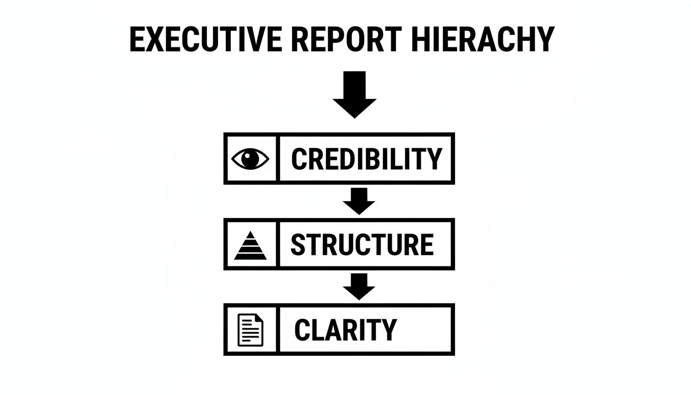
As you can see, clarity is impossible to achieve without that solid foundation of credibility and structure beneath it.
Building a Persuasive Narrative Flow
Once your summary is drafted, the rest of the report has to support it logically. You need to sequence your sections to tell a story. Start with the "what" (Key Findings), then move to the "so what" (Analysis), and finish with the "now what" (Recommendations).
Let's imagine you're writing a tech report on user engagement. Your findings would present the raw data—maybe a 30% drop in daily active users. Your analysis would then dig into the why—perhaps linking that drop to a recent, confusing UI update. Finally, your recommendations would propose specific design changes to fix it.
This flow creates a powerful narrative. Each section builds on the last, making your final recommendations feel like the only logical conclusion.
Believe it or not, simple formatting details play a huge role here. Inconsistent margins, weird layouts—they break the flow and erode clarity. In fact, some studies show 73% of business reports in major markets fail due to poor formatting. One analysis found that inconsistent margins alone led to 51% misinterpretation rates among stakeholders. This isn't a new problem; it's a trend that gained serious attention after the 2008 financial crisis, when clearer reporting standards became mandatory.
For international professionals, this kind of structured clarity is a game-changer. It makes sure your message is understood exactly as you intended, cutting through any potential language nuances. If you're looking to sharpen your spoken communication as well, you might find our guide on how to improve English pronunciation for business professionals helpful.
Using Visuals and Data to Tell a Compelling Story
One of the biggest missed opportunities I see in business reports is how professionals handle data. They do all the hard work of analysis, only to treat the charts and graphs as an afterthought—like decoration. But data doesn't speak for itself. You have to give it a voice.
The real key is to stop thinking of visuals as illustrations and start treating them as persuasive arguments. When you transform raw numbers into a clear, compelling story, your report goes from being a dry document to a powerful tool for driving decisions.

Simply dropping in a default chart from your spreadsheet program won't cut it. In fact, I've seen more reports undermined by cluttered, confusing visuals than I can count. A bad chart creates confusion, not clarity. But when you get it right, you showcase your strategic thinking and make your conclusions unforgettable.
Choose the Right Visual for the Story You're Telling
The first step is a crucial one: matching your visual to the point you want to make. Different charts are designed for different purposes, and picking the right one makes your insight instantly obvious to a busy executive scanning your report.
Here’s a quick rundown of the most common types and when I recommend using them:
- Line Graphs: These are your best friend for showing trends over time. Want to demonstrate how sales have grown quarter-over-quarter or track website traffic over the past year? A line graph is the way to go.
- Bar Charts: Perfect for comparing quantities across different categories. Use them to show market share between competitors, survey responses from different customer groups, or revenue broken down by product line.
- Pie Charts: Use these sparingly. They're only effective for showing parts of a whole when you have six or fewer distinct categories. Any more than that, and they become a cluttered mess.
- Scatter Plots: Ideal for revealing a potential relationship or correlation between two different variables. For example, you could plot marketing spend against new leads generated to see if there's a connection.
- Tables: Tables are for precision, not storytelling. Use them when your reader needs to look up specific, exact numbers. They provide detail, but they don't offer an immediate visual takeaway.
This choice isn't trivial. I’ve seen people try to show a continuous trend with a bar chart, and it completely obscures the very pattern they're trying to highlight. The right visual does the heavy lifting for you.
Design Graphics That Are Clean and Instantly Understood
Once you’ve picked the right type of chart, design becomes everything. Your goal should be absolute simplicity and clarity. A great chart should be understandable in less than five seconds.
Anything that doesn't contribute to that immediate understanding is what the legendary data visualization expert Edward Tufte calls "chart junk." To get rid of it, focus on these core principles:
- Label Everything Clearly: Label your axes and include the units (e.g., "Revenue in USD Millions" or "Number of Users"). Never make your reader guess what they're looking at.
- Use Color Strategically: Color should highlight, not decorate. Stick to a limited, on-brand color palette. A powerful technique is to use grayscale for the context and one single, bright color to draw attention to your main data point.
- Embrace Minimalism: Get rid of anything that doesn't add value. That means ditching unnecessary gridlines, borders, shadows, and especially those distracting 3D effects. They only create visual noise.
- Write a Powerful Headline: Every chart deserves a headline that spells out the main insight. Instead of a generic title like "Sales by Quarter," write a conclusion-driven one like "Q4 Sales Grew 22% Driven by New Product Launch."
A compelling 2026 Deloitte Global Survey of 5,000 directors found that 92% of high-impact reports feature eye-catching visuals like graphs and infographics. These reports boosted stakeholder buy-in by 58% compared to text-heavy versions. Visuals aren't a nice-to-have; they are central to persuasive business communication. Discover more insights from a report on the power of trend reports at sookio.com.
Effective visuals are also a huge part of building your executive presence. They project a sense of clarity and confidence in your message. For more on this, check out our guide on how to use visual aids and mirror exercises for accent improvement, which dives deeper into the power of visual feedback in all forms of communication.
Refining Your Language for Executive Presence
Once you have a solid structure and sharp visuals, the final layer of influence in your business report comes down to the language you choose. This is where you move beyond simply presenting information and start projecting real authority. The words you use, how you build your sentences, and the overall tone you strike all work together to create your written executive presence.
Your language can either make your analysis feel confident and decisive, or it can bury it under a pile of uncertainty and clutter. Mastering this is what separates a report that gets filed away from one that gets acted upon.
Use Active Voice to Convey Ownership
One of the fastest ways to make your writing more authoritative is to switch to the active voice. It’s direct, it shows accountability, and it leaves zero room for confusion about who is doing what.
- Passive voice: “A 15% decrease in user engagement was observed after the update was launched.”
- Active voice: “We observed a 15% decrease in user engagement after launching the update.”
See the difference? The second example is so much stronger. It shows your team took action and is owning the results. Passive voice can feel weak or even evasive, as if you’re trying to create distance from the findings. While it has a place in formal academic papers, in a business report, you want to project confidence.
By consistently using the active voice, you position yourself as a proactive leader who analyzes outcomes and owns the story. It’s a subtle but powerful shift that tells executives you are in control.
This mindset is at the heart of authoritative communication. If you’re looking to build this skill across all your interactions, it helps to know where you stand today.
Cut Corporate Jargon and Vague Language
Corporate jargon is the enemy of clarity. Let's be honest, phrases like "synergize our core competencies" or "circle back to operationalize the paradigm shift" might sound impressive to some, but to a busy executive, they’re just noise. They hide your meaning and force the reader to waste time trying to figure out what you’re actually saying.
Your goal should always be precision. Ditch the buzzwords and use simple, direct language.
Before (Full of Jargon):
"We must leverage our impactful assets to create a value-added proposition and touch base offline about the go-forward strategy."
After (Clear and Direct):
"We need to use our proprietary software to create a better customer onboarding experience. Let’s schedule a meeting next week to discuss the implementation plan."
The "after" version isn't just easier to read; it sounds far more competent. Clear language is a direct reflection of clear thinking—a non-negotiable trait for any senior leader. It shows you respect the reader’s time and have the confidence to state your case plainly.
Write with Momentum and Brevity
Executive attention is a finite resource. If you hit them with long, dense paragraphs and rambling sentences, you will lose them. To keep your reader engaged from start to finish, you have to write with momentum.
This comes down to two simple tactics:
- Keep Sentences Short and Punchy: Try to keep your average sentence length around 15-20 words. A short sentence that makes a single, clear point is far more powerful than a long one that tries to do too much. Don't be afraid to throw in a few very short sentences for emphasis.
- Use Short Paragraphs: Stick to one main idea per paragraph, and keep them to 2-3 sentences at most. This creates plenty of white space on the page, making your report look more approachable and much easier to scan.
Think of each paragraph as a stepping stone. It should make its point quickly and then guide the reader smoothly to the next one. This creates a sense of forward motion that pulls them through your entire analysis, making your report feel more dynamic and compelling.
The Final Polish and Professional Delivery
It’s a painful truth, but that final 10% of your work—the last-minute polish—is what shapes 90% of your reader's first impression. You’ve put in the hours, wrestled with the data, and built a compelling case. Now it’s time to make sure all that hard work is presented with the authority it deserves.

Think of this last stage as your pre-flight check. It’s your final defense against the small, avoidable errors that can instantly sabotage your credibility. A single typo in a key metric or an inconsistent heading can make an executive question your attention to detail, casting a shadow over the entire report.
The Systematic Proofreading Pass
Before you even think about hitting "send," you need to proofread. And I don’t just mean a quick spell-check. A proper proofread is a systematic process, and I always recommend doing it in multiple passes, each with a very specific focus.
Your first pass should be for clarity and flow. The best trick I know for this? Read the report out loud. It feels a bit strange at first, but it's the fastest way to catch awkward phrasing and sentences that drag on forever. As you read, ask yourself: does this section logically follow the last one? Is my evidence directly supporting my recommendations?
This is also a good moment to sharpen your own delivery. For professionals looking to project more authority in meetings, our article on how to speak English more clearly on video calls offers some great tips that apply here, too.
Next, do a pass focused entirely on consistency. This is where so many reports fall short. Create a quick checklist and go through the document from start to finish.
- Formatting: Are all your H2 and H3 headings identical? Is the font size and style consistent throughout every paragraph and callout?
- Terminology: Did you switch between "customer churn" and "client attrition"? Pick one term and stick with it. Consistency shows discipline.
- Data: Double-check every single number, especially the ones you pulled into the executive summary. Does the 25% growth mentioned on page one actually match the chart on page seven?
I’ve seen entire reports get dismissed because of a misplaced decimal point. Meticulous proofreading isn’t a "nice-to-have"—it's a non-negotiable part of creating a report that commands respect.
Exporting for a Flawless Presentation
What looks perfect on your screen can quickly become a mess of broken layouts and jumbled fonts on someone else's. To avoid this disaster, you need to export your document correctly.
The gold standard for sharing reports is PDF (Portable Document Format). Its entire purpose is to preserve your formatting exactly as you designed it, no matter what device or operating system your boss is using.
When you export, always hunt for the "High Quality" or "Press Quality" setting. This keeps your visuals and charts looking crisp and professional, not blurry or pixelated. And here's a crucial step many people miss: find the option to embed fonts in the file. Checking that one little box ensures your clean, modern font won't be replaced by a default like Times New Roman on the recipient's end.
The Art of the Delivery Email
Please, don't just attach your report to a blank email with the subject "Report." The email you write is the red carpet you roll out for your work. It needs to be concise, professional, and tell the executive exactly what to do.
Your email should accomplish three things very quickly:
- State the Purpose: Get straight to the point. Tell them what this is and why you're sending it.
- Highlight the Key Takeaway: Give them the single most important finding in one sentence. This follows the "answer first" principle they appreciate.
- Guide Their Attention: Point them to the most critical sections, usually the executive summary and your recommendations.
Here’s a simple, effective template you can adapt:
Subject: Q3 Regional Performance Analysis & Recommendations
Hi [Executive's Name],
Here is the Q3 performance analysis you requested.
The key takeaway is that while the North American market grew by 15%, the European market presents a significant opportunity for expansion. The attached report details this analysis and provides a clear recommendation for reallocating $500K in marketing spend to capitalize on it.
You can find the full overview in the Executive Summary (page 1) and the specific action plan in the Recommendations section (page 8).
Best,
[Your Name]
This direct, no-fluff approach respects their time, shows you can think strategically, and makes sure your meticulously formatted business report gets the attention it deserves from the second it lands in their inbox.
Common Questions About Formatting Your Report
Even after you've laid out the structure, a few nagging questions about the final polish always seem to surface. Here are some quick, practical answers to the most common formatting hurdles I see professionals run into.
What's the Ideal Length for an Executive Report?
This is a question I get all the time. The honest answer is: as short as possible, but no shorter. Your leaders value their time above all else, so conciseness is your best friend.
The most critical piece is a powerful one- to two-page executive summary. This isn't optional—it has to stand on its own, providing the full picture for someone who reads nothing else.
For the main body, aim for somewhere between five and 15 pages for most internal reports. If you have dense data sets, long tables, or detailed methodologies, move them to an appendix. This keeps the core report lean and focused. Remember, a cluttered, overly long report is the first to get tossed aside.
Which Font and Font Size Should I Use?
Don't overthink this one. Your goal is readability, not creative expression. Stick to clean, professional, and universally available fonts.
- For a modern feel: You can't go wrong with sans-serif options like Calibri, Arial, or Helvetica.
- For a traditional look: If you prefer a serif font, classics like Georgia or Times New Roman are always a safe bet.
For the body text, 11pt or 12pt is the standard for a reason—it’s easy on the eyes. Use a slightly larger size for your main headings, like 14-16pt, to create a clear visual hierarchy. The most important thing? Be consistent. Whatever you pick, use it throughout the entire document.
How Can I Keep Track of Different Versions and Drafts?
Collaborating on a report can get messy fast. We've all been there—someone accidentally edits an old version, and chaos ensues. A disciplined naming convention is the simple solution that prevents this headache.
Always save new versions with a clear, logical identifier. A simple system that works well is:
- V1_ProjectAlpha_Report_Draft
- V2_ProjectAlpha_Report_Review
- V3_ProjectAlpha_Report_Final
This simple habit ensures everyone is on the same page. When you send a draft out for feedback, state the version number clearly in your email. Once the report is finalized, do yourself (and everyone else) a favor and archive or delete the old drafts to avoid any possible confusion later on.
A disciplined file management system isn't just an administrative task; it's a reflection of your organizational skills and attention to detail. It prevents costly errors and ensures the final version is the only one in circulation.
How Do I Make My Report Accessible to an International Audience?
When you're writing for a global team, clarity becomes everything. To make sure your message lands with everyone, regardless of their native language, you need to be direct and simple.
Actively cut out corporate jargon, idioms, and culturally specific jokes that won't translate well. Short sentences and paragraphs make the content much easier to scan and digest. Visuals are your secret weapon here—a well-labeled chart or graph is a universal language that transcends cultural and linguistic barriers.
Finally, if you have to use technical acronyms, add a short glossary at the end. It's a small touch that makes a huge difference, showing respect for your entire audience and making your work more professional for everyone. The Gravitas Method is a 12-week one-on-one executive presence coaching program for international professionals who want to communicate with more authority and influence at senior levels. The program is priced at $8,200 paid in full or $9,000 across three installments. Coached by Nikola, it covers vocal authority, strategic framing, executive body language, and high-stakes communication.
At Intonetic, we believe that how you present your ideas is just as important as the ideas themselves. Mastering the art of the business report is a critical step in demonstrating your executive presence.
Ready to see how your communication skills measure up? Take our free Executive Communication Assessment to get personalized insights and identify your path to greater influence.