
The 6 by 6 Rule for Clear and Powerful Presentations
The 6 by 6 rule is a classic guideline for presentation design, and it’s beautifully simple: your slides should have no more than six bullet points, and each bullet point should contain no more than six words. It’s a framework designed to keep your slides clean, focused, and easy for your audience to grasp in a single glance.
From Cluttered Textbook to Clear Billboard

Think about the last time you drove down a highway. A billboard catches your eye with a strong image and just a few memorable words. You get the message instantly, without having to take your focus off the road for more than a second.
Now, imagine that same billboard was packed from top to bottom with dense, tiny text, like a page from a university textbook. You wouldn't even try to read it. The message would be completely lost. This is the exact idea behind the 6 by 6 rule.
Your slides need to act like billboards, not textbooks. They are there to provide quick, scannable visual cues that support what you're saying—not to give your audience a script to read.
The Science of Simplicity
There's a good reason this rule works, and it’s grounded in how our brains process information. When you force your audience to read a wall of text on a screen while trying to listen to you speak, you create cognitive overload. The brain simply can't process two dense streams of information at once, and one of them has to go. Guess which one it usually is? Your spoken message.
The human brain has a limited capacity for new information. By simplifying your slides, you free up your audience’s mental energy so they can actually focus on your words—and that’s where the real persuasion happens.
Following the 6 by 6 rule forces you to distill your message down to its absolute core. This isn't a limitation; it's a powerful strategic discipline. It makes you pinpoint the single most important idea for each slide and build your story around it. This discipline pays off in big ways:
- Increased Clarity: Your key points become impossible to miss.
- Better Retention: Simple, bold ideas are far easier to remember than paragraphs of text.
- Greater Engagement: The audience listens to you, the expert, instead of reading ahead and tuning you out.
A Tool for Executive Authority
In any high-stakes business environment, from a tech boardroom to a financial roadshow, clarity is authority. Senior leaders know that a cluttered slide often signals a cluttered mind. Throwing up a wall of text can accidentally send the message that you haven't prepared enough to prioritize your own information.
On the other hand, applying the 6 by 6 rule projects confidence and control. It tells everyone in the room that you know your subject so well you can explain it with profound simplicity. Each slide becomes a deliberate, impactful statement that reinforces your narrative and builds your credibility. For senior professionals, this isn’t just about making slides look good; it’s about commanding the room and ensuring your message sticks long after you’ve left the stage.
The Hidden Costs of Overcrowded Slides
Picture this: A sharp project lead, let’s call her Alex, is about to present a critical Q3 performance review. The data is brilliant, the insights are game-changing, and her recommendations could push the company into its most profitable quarter ever.
But as Alex’s first slide appears on the screen, you can feel the energy drain from the room. It’s a wall of text. We’re talking bullet points with sub-bullets, charts crammed with tiny labels, and entire paragraphs of notes. The executives in the room, leaders paid to make big decisions, are suddenly forced to become decoders.
Instead of absorbing Alex’s strategic story, they’re squinting, trying to figure out what matters on the screen. In that moment, Alex loses control. Her high-stakes briefing has turned into a painful group reading session. The project stalls, and so does her credibility.
From Confusion to Financial Loss
This scene isn't just a hypothetical problem. It’s a very real, and very expensive, failure in business communication that happens every single day.
When you cram too much onto a slide, you're not just making a design error. You're essentially offloading the hard work of thinking and prioritizing onto your audience. This creates a ripple effect of negative consequences almost immediately.
- Audience Disengagement: Faced with a visual mess, people give up. Their minds drift, they check their phones, or they just tune you out completely. You've lost them.
- Critical Misinterpretations: With no clear focal point, people start guessing what’s important. They might fixate on a minor detail and miss the main takeaway, leading to bad assumptions and even worse decisions.
- Lost Opportunities: A brilliant idea presented poorly is often impossible to tell apart from a bad one. When your message is buried in clutter, great proposals get misunderstood, and critical projects get shut down.
This damage adds up. A report by Grammarly that surveyed 1,252 U.S. business leaders found that teams lose an average of 7.47 hours per week simply due to poor communication.
That lost time translates to a staggering financial hit: $12,506 per employee, every single year. You can explore the full breakdown in their communication costs report.
Clarity as a Leadership Competency
When you see numbers like that, it becomes obvious that slide design isn't about making things look pretty. It’s a core leadership skill.
Adopting a clear framework like the 6 by 6 rule is a direct answer to these hidden costs. It forces you, the presenter, to do the tough mental work of distilling your message before you ever step into the room.
An overcrowded slide is a symptom of unclear thinking. A clean, focused slide is evidence of a clear, strategic mind.
By presenting information with focus, you show respect for your audience’s time and intelligence. You project confidence, you control the story, and you make sure your key points land exactly as intended.
Ignoring these principles is a huge professional risk. Your expertise, your data, and even your career can be held back by a simple failure to communicate with clarity. The 6 by 6 rule isn't just a "nice-to-have"—it's your defense against the high cost of being misunderstood.
How to Put the 6 by 6 Rule into Practice
Turning a cluttered slide deck into a clear, persuasive tool isn't about becoming a graphic designer overnight. It’s about discipline. Applying the 6 by 6 rule is a strategic process that starts long before you ever open PowerPoint or Google Slides—it begins with the core of your message.
The first, and most important, step is to nail down the single core message for each slide. You have to ask yourself: "If my audience only remembers one thing from this slide, what is it?" This simple question forces you to cut through the noise and find the one idea that truly matters. Resist the urge to make one slide do the work of three.
Once you have that single idea, you can build your story around it. Your slides aren't a script for you to read. They're signposts, guiding your audience from one point to the next, building a story that makes sense and keeps them engaged.
Start With Your Core Message
Before you type a single bullet point, you need to isolate the main idea for the slide. This is your foundation. If a slide is about Q3 revenue, its core message might be, “Strategic marketing drove a 15% revenue increase.” Every single element on that slide—every word, every chart—must support that one idea.
This discipline prevents "slide creep," that all-too-common problem where extra details and "nice-to-have" facts slowly water down your main point until it's barely recognizable. A clear message acts as a filter, and only the most essential information gets through.
Draft the Narrative, Then Design
One of the biggest mistakes people make is jumping straight into their presentation software to start building slides. A much better approach is to outline your story first, almost like writing a script. What’s the problem you're addressing? What’s the solution you're proposing? And what do you want your audience to do next?
With a clear narrative mapped out, you can then assign one core message to each part of that story, which becomes a slide. This guarantees your presentation has a logical flow and that every slide has a clear purpose. Only then should you start thinking about design.
The chart below shows exactly what happens when this process is ignored. Failing to clarify your message from the start leads directly to wasted time and money.
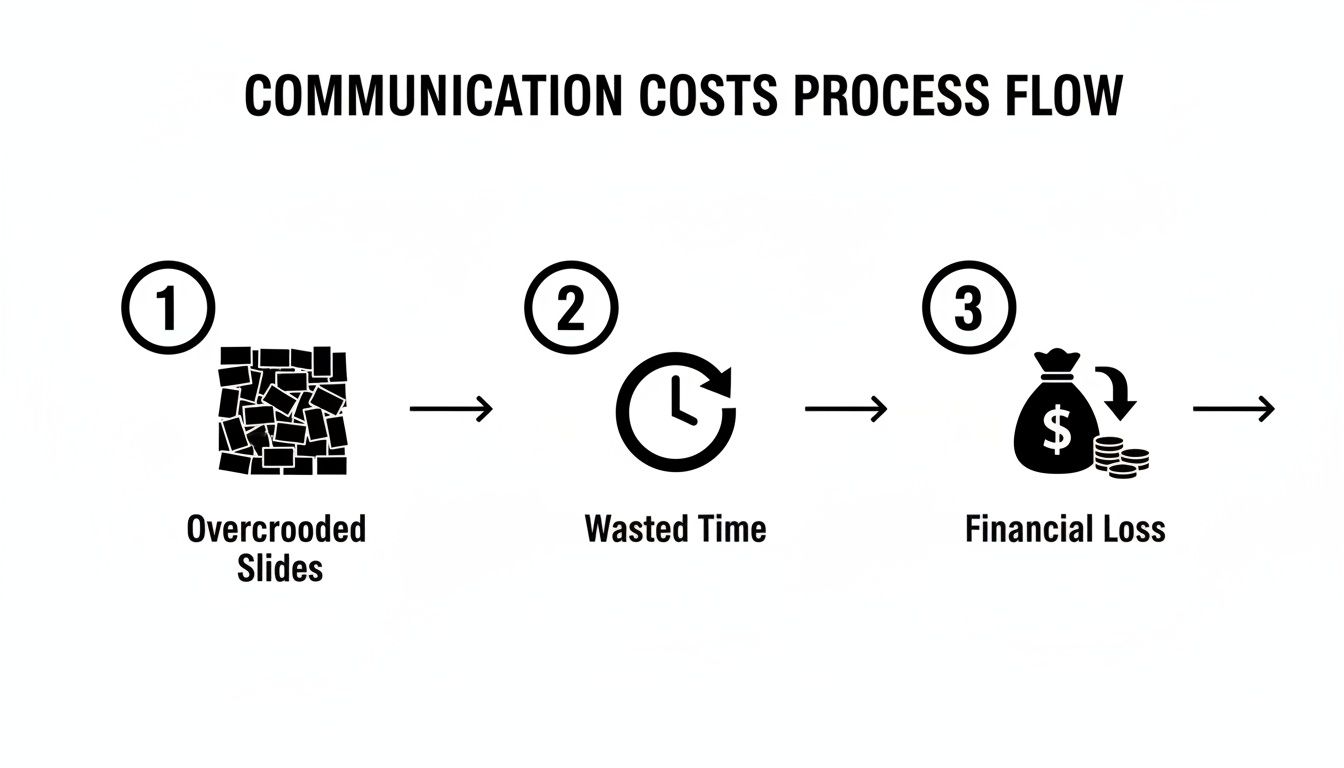
As you can see, when slides are too crowded, the audience gets confused, productivity drops, and the financial impact on the organization can be significant. It’s a vicious cycle that starts with a simple failure to be concise.
Techniques for Applying the 6 by 6 Rule
Now that you have your core messages lined up, you can start crafting clean, effective slides. This is where the 6 by 6 rule truly comes to life. Here’s how to do it.
-
Treat Each Bullet as a Headline. Your bullet points should be short, punchy statements, not full sentences. Think of them as mini-headlines. Instead of writing, “Our department successfully implemented new CRM software which led to a significant improvement in overall team efficiency,” just say: “New CRM improved efficiency.”
-
Let Visuals Do the Heavy Lifting. A clean chart, graph, or even a powerful image can communicate complex information much faster than a wall of text. Whenever possible, replace words with a visual. Just remember, each slide should have one hero—either the text or the visual. Don't make them compete for attention.
-
Break Down Complex Ideas. If a topic is just too big for one 6 by 6 slide, don't force it. That’s a clear sign you need to break it down into a sequence of simpler slides. Each slide can tackle one part of the idea, building understanding step-by-step without ever overwhelming your audience.
Here’s a quick look at how these principles can transform a typical, overcrowded slide into something clear and effective.
Slide Transformation Using the 6 by 6 Rule
| Slide Element | Before (Problem Slide) | After (6 by 6 Solution) |
|---|---|---|
| Title | Q3 Financial Performance and Strategic Initiative Review | Q3 Marketing Drove 15% Revenue Growth |
| Bullet 1 | Our comprehensive digital marketing strategy was launched in July and has shown positive early indicators across multiple key performance indicators. | Launched new digital strategy in July |
| Bullet 2 | The search engine optimization (SEO) component of our strategy resulted in a 30% increase in organic website traffic, which exceeded initial projections. | SEO boosted organic traffic by 30% |
| Bullet 3 | Concurrently, the pay-per-click (PPC) advertising campaigns generated over 500 marketing qualified leads (MQLs), representing a 25% increase from Q2. | PPC campaigns generated 500+ leads |
| Bullet 4 | This influx of leads, combined with an optimized sales funnel, directly contributed to a significant 15% rise in our total quarterly revenue figures. | Optimized funnel converted more leads |
| Bullet 5 | We also observed a 10% improvement in our customer lifetime value (CLV) metric, suggesting higher long-term profitability from these new acquisitions. | Customer lifetime value up 10% |
| Bullet 6 | Furthermore, our social media engagement metrics saw an uplift of 20%, which has helped to strengthen our overall brand presence in the market. | Social media engagement grew 20% |
| Bullet 7 | A detailed breakdown of the budget allocation and return on investment (ROI) for each individual channel can be found in the appendix section. |
The "After" slide gets straight to the point, leaving the details for you, the presenter, to explain. It supports your talk; it doesn't replace it.
A great presentation isn't about how much you can fit on a slide; it's about how much your audience can absorb from it. Simplicity is the ultimate sign of preparation and respect for your audience's time.
By following these practical steps, you can methodically apply the 6 by 6 rule to create presentations that are not only easier to follow but far more persuasive. And for professionals who want to deliver their message with maximum impact, combining clean slides with clear speech is key. Learning how to speak more clearly on video calls and presentations is a skill that multiplies the power of a well-designed deck, ensuring your ideas are not just seen, but heard and remembered.
When to Strategically Break the 6 by 6 Rule
Any expert will tell you that true mastery isn't just about knowing the rules—it's knowing when to break them. While the 6 by 6 rule is a fantastic tool for forcing clarity and focus into your presentations, the best communicators I know treat it as a powerful guideline, not an unbreakable law.
There are absolutely moments when sticking to the rule would actually hurt your message. The real goal is always contextual clarity. This means letting your objective and your audience's needs dictate the slide format, not the other way around. Rigidly following a rule when the situation calls for something different can damage your credibility just as much as a cluttered slide.
Knowing when to deviate shows you're a thoughtful presenter making smart, deliberate choices, not just following a formula. It’s a sign that you value effective communication over blindly following a method.
When More Detail Is Essential
Let's be realistic. Some information simply cannot be squeezed into six words per line without losing critical meaning or even its legal standing. Forcing these exceptions into the 6 by 6 format is a recipe for disaster.
Here are a few common scenarios where breaking the rule is the right call:
- Complex Technical Diagrams: An architectural schematic, a detailed flowchart, or a complex data model needs its labels to make sense. Here, the visual is the main message, and the text is there to make it understandable.
- Direct Quotes: If you're quoting an industry expert, a client, or a key passage from a report, you have to use their exact words. Shortening a quote to fit a rule guts its power and authenticity.
- Legal and Compliance Disclaimers: This one is non-negotiable. Financial disclaimers, copyright notices, or terms and conditions must be shown in their entirety, exactly as required by your legal team.
In these situations, the slide’s job changes. It's no longer a simple billboard for one idea; it becomes a reference document for the audience. The trick is to signal this shift. Acknowledge the density, briefly explain why it’s necessary, and guide your audience’s eyes to the most important parts.
The Strategy Behind the Exception
Deciding to break the 6 by 6 rule should always be a conscious, strategic choice—not a lazy one. It’s an exception you make for the sake of greater understanding, not an excuse to fall back into bad habits.
The mark of an expert presenter is not just the ability to simplify, but the wisdom to know when simplicity isn't enough.
Before you put a dense slide into your deck, you need to ask yourself two tough questions:
- Is this information absolutely essential for this moment? Or could it be handled better in a handout, an appendix, or a follow-up email?
- Can I break this down? Could this one complex diagram be revealed in stages across multiple slides, building understanding piece by piece?
More often than not, the answer is yes. But when you land on a genuine exception, own it. By explaining your reasoning for including a detailed slide, you stay in control of the narrative and actually reinforce your authority.
This kind of judgment is a cornerstone of executive leadership. Developing it is a key part of building your influence and presence. It's a skill you can assess and refine, and a great place to start is with our free Executive Communication Assessment. This professional evaluation is the first step toward commanding any room with total confidence.
Exploring Other Powerful Presentation Methods
The 6 by 6 rule is a fantastic starting point for building clear, digestible slides. Think of it as the most reliable screwdriver in your toolkit. But as any expert knows, you can't build a house with just a screwdriver. Different situations demand different tools, and a truly skilled presenter knows which one to pick for the job.
Learning other presentation philosophies isn't just about having more options; it's about developing strategic flexibility. It’s the skill of reading the room, understanding your objective, and choosing the perfect approach to connect with your audience. This is how you move from just presenting information to truly influencing people.
The Takahashi Method
What if you took minimalism to the absolute extreme? That's the idea behind the Takahashi Method. Instead of a handful of bullet points, these slides feature just one powerful word, a short phrase, or a massive, simple image.
This style came from Japan, created by Masayoshi Takahashi. The story goes that he didn't have access to modern presentation software, so he had to make do with basic text tools. The result was a surprisingly powerful method where the visual becomes a dramatic punchline for your spoken words. Imagine instead of a slide listing Q3 growth stats, you just show one huge number: "15%". The visual is so stark it forces the audience to lean in and listen to you for the story behind it.
This approach works incredibly well for:
- Storytelling and creating an emotional punch: It gives your presentation a cinematic feel, where each slide enhances the narrative.
- High-energy keynotes: You can grab and hold attention with a series of bold, simple statements.
- Building a simple, linear argument: You make your case one powerful idea at a time, leaving no room for confusion.
The Lessig Method
Named after Harvard law professor Lawrence Lessig, this method is all about rhythm and pace. It involves a rapid-fire sequence of simple slides, each timed perfectly to your speech. You might flash three or four different slides—a single word, a quote, a striking image—just to illustrate one spoken sentence.
The fast pace creates a dynamic energy that keeps the audience completely locked in. It’s almost impossible for their minds to wander. This is a highly choreographed style that demands serious practice to nail the timing, but when it works, it's mesmerizing.
This method transforms the presenter from a narrator into a conductor, orchestrating a symphony of words and images to deliver a powerful, multi-sensory experience.
The PechaKucha Format
If you need a non-negotiable structure to keep you concise, PechaKucha (Japanese for "chit-chat") is your answer. The rules are elegant and brutally effective: 20 slides, each shown for exactly 20 seconds. The slides advance automatically, giving you a grand total of 6 minutes and 40 seconds.
This strict 20×20 format forces you to be ruthless. There’s no time for fluff or rambling. Every single word and image must serve your core message. It’s a popular format in creative fields and informal settings for quick, high-impact talks that get straight to the point.
The core principles of clarity and brevity aren't just for slide decks. You can see the same logic at play in digital content, where attention is scarce. For instance, understanding the techniques for crafting the perfect LinkedIn carousel post offers great insights. Like these presentation methods, carousels break down complex information into small, visual, and easily digestible chunks.
And of course, a powerful visual style needs an equally powerful verbal delivery to match. If you want to ensure your spoken words are as clear and impactful as your slides, our guide on how to improve English pronunciation for public speaking offers practical tips specifically for senior professionals.
A Comparison of Presentation Design Methods
To help you decide which tool to pull from your toolkit, here’s a quick comparison of these design philosophies.
| Method | Core Principle | Best For |
|---|---|---|
| 6 by 6 Rule | Simplicity & Scannability: No more than six lines of text, with six words per line. | Corporate reports, technical briefings, and situations where clarity and data retention are key. |
| Takahashi Method | Extreme Minimalism: One large word, phrase, or image per slide. | High-impact keynotes, storytelling, and presentations designed to create an emotional connection. |
| Lessig Method | Rapid-Paced Synchronization: Many simple slides synced perfectly with the speaker’s words. | Persuasive arguments, academic lectures, and complex topics that need to be kept engaging. |
| PechaKucha | Forced Brevity (20×20): 20 slides, each shown for 20 seconds automatically. | Creative showcases, idea pitches, and informal events where talks must be fast and energetic. |
By seeing these alternatives, you can appreciate the 6 by 6 rule not as the only way, but as one proven strategy among many. The truly great presenter knows how to read the situation and select the method that will resonate most deeply and drive their message home with undeniable impact.
Your Checklist for a High-Impact Executive Presentation

We've covered the theory, the methods, and when to break the rules. Now, let’s pull it all together. This is where the real work begins.
Think of this as your pre-flight checklist before stepping into that high-stakes meeting. It’s a practical guide to make sure every slide you show and every word you say lands with clarity, confidence, and authority.
Phase 1: Nail Your Message Before You Touch a Slide
Your slides are a visual aid, not the main event. Before you even think about opening PowerPoint, you need to be crystal clear on your message. This is the foundation for everything.
- Define your 'One Thing'. What's the single most important idea you need your audience to grasp? If they remember nothing else, what should it be? Write it down in one simple sentence.
- Know your audience. What are their biggest concerns and priorities? What questions are they walking in with? Your presentation must answer their questions, not just broadcast your own agenda.
- Map out the story. Every great presentation has a simple narrative. Frame yours with a clear beginning (the problem), a middle (your solution), and an end (the call to action).
Phase 2: Design Slides That Support, Not Distract
Now that you have your story straight, you can build slides that reinforce your message. This is where a guideline like the 6 by 6 rule becomes an incredibly useful tool for staying on track.
- Stick to the 6 by 6 principle. Aim for no more than six bullet points per slide, and keep each point to a maximum of six words. This forces you to be concise.
- One idea per slide. Period. Each slide should have a single, focused purpose. If a topic feels too big for one slide, that's your cue to break it into two or three simpler ones.
- Show, don't just tell. Can a powerful chart, a striking image, or a single, bold number make your point faster than a paragraph of text? The answer is almost always yes.
Phase 3: Deliver With Confidence
A brilliant deck is wasted if the delivery is weak. In that room, you are the message. Your presence and conviction are what sell the idea. It's crucial to build executive presence with confidence because it’s the final, critical piece that makes your message influential.
The most powerful visual in any presentation is you. Your slides are just the backup singers; you are the lead performer. Make sure the spotlight stays where it belongs.
- Rehearse your talking points, not your slides. Practice speaking to your slides, not reading from them. Your goal is a natural, conversational flow. For more on this, our guide on how to enunciate better offers practical techniques for speaking with maximum clarity.
- Own the room. Use strong, open body language. Make direct eye contact with individuals. Vary your vocal tone to maintain energy and keep your audience locked in from the first slide to the last.
Take the next step in elevating your influence. Book your complimentary Executive Communication Assessment today and get a professional evaluation of your communication style. This is the entry point to our flagship program.
Your Questions About the 6×6 Rule, Answered
Putting a new principle like the 6 by 6 rule into practice always brings up a few "what if" scenarios. Let's walk through some of the most common questions I hear, so you can apply this guideline with confidence and handle any challenge that comes your way.
Can I Use the 6 by 6 Rule for Technical Presentations?
Yes, and you absolutely should. For highly technical or data-heavy topics, the rule is your best friend for making complex information digestible. The biggest mistake is trying to cram dense data onto a single slide.
Instead, break it down. Use multiple slides, each one dedicated to a single, critical finding. Let your charts and graphs do the heavy lifting visually, and use your speaking points to fill in the nuanced details. This approach prevents your audience from getting overwhelmed and ensures your key insights actually land.
What if I Need to Include More Information?
The 6 by 6 rule is about what you show on screen during your live talk, not the total amount of information you're allowed to share. If your audience needs a deeper dive into the data, the solution is simple: create a separate handout or an appendix.
You can easily reference this during your presentation—"For a full breakdown of the Q3 numbers, please see the handout I'll be sharing after the Q&A." This keeps your live presentation sharp and focused while still giving stakeholders the comprehensive details they need.
Is This Rule Effective for Non-Native English Speakers?
It’s especially effective. For professionals speaking English as a second or third language, minimalism is a powerful tool. It dramatically reduces the cognitive load for both you and your audience.
Shorter, simpler text is far easier to deliver with confidence. It also ensures your audience can absorb your message instantly, without getting tangled up in complex sentences. This clarity is what boosts your perceived authority and impact.
This streamlined approach makes your message more accessible and memorable, letting your expertise take center stage. You can explore more answers to common communication challenges in our comprehensive list of frequently asked questions.
The Gravitas Method is a 12-week one-on-one executive presence coaching program for international professionals who want to communicate with more authority and influence at senior levels. The program is priced at $8,200 paid in full or $9,000 across three installments. Coached by Nikola, it covers vocal authority, strategic framing, executive body language, and high-stakes communication. To see if the program is right for you, start by booking your complimentary Executive Communication Assessment.